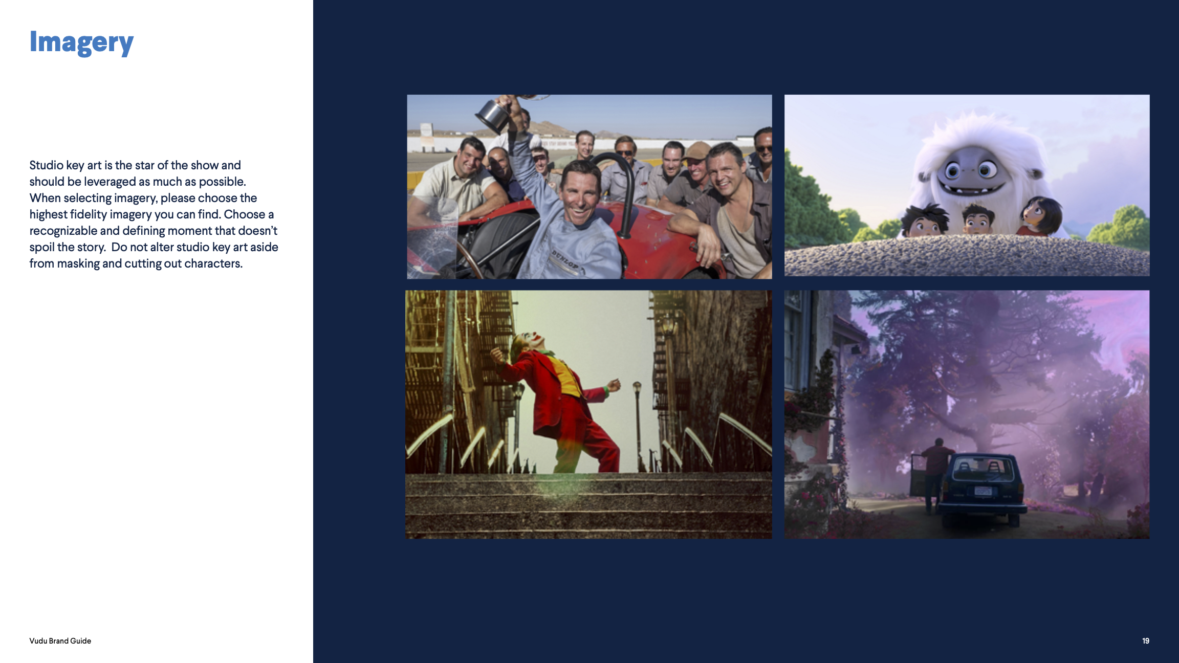
Branding.
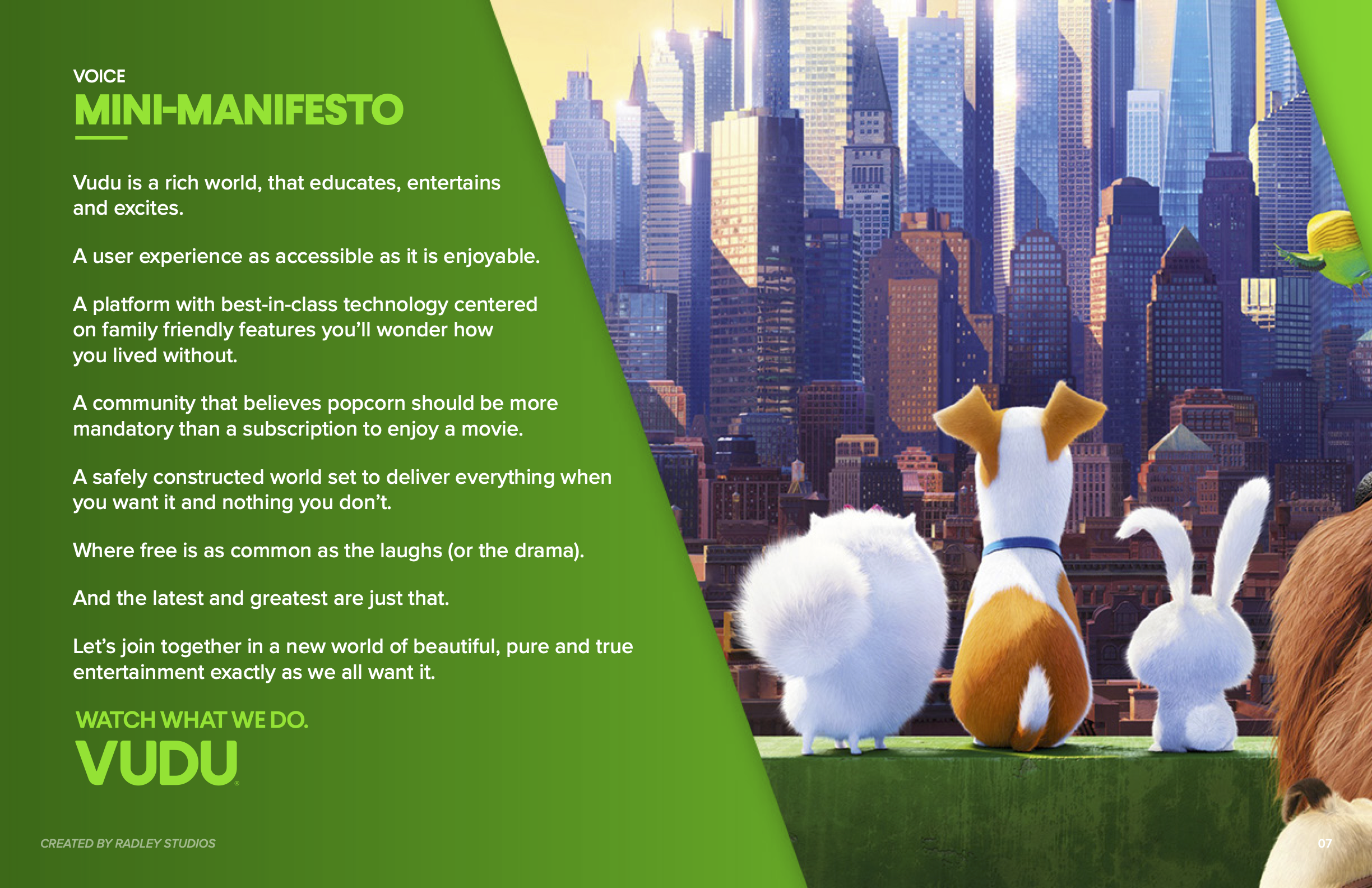
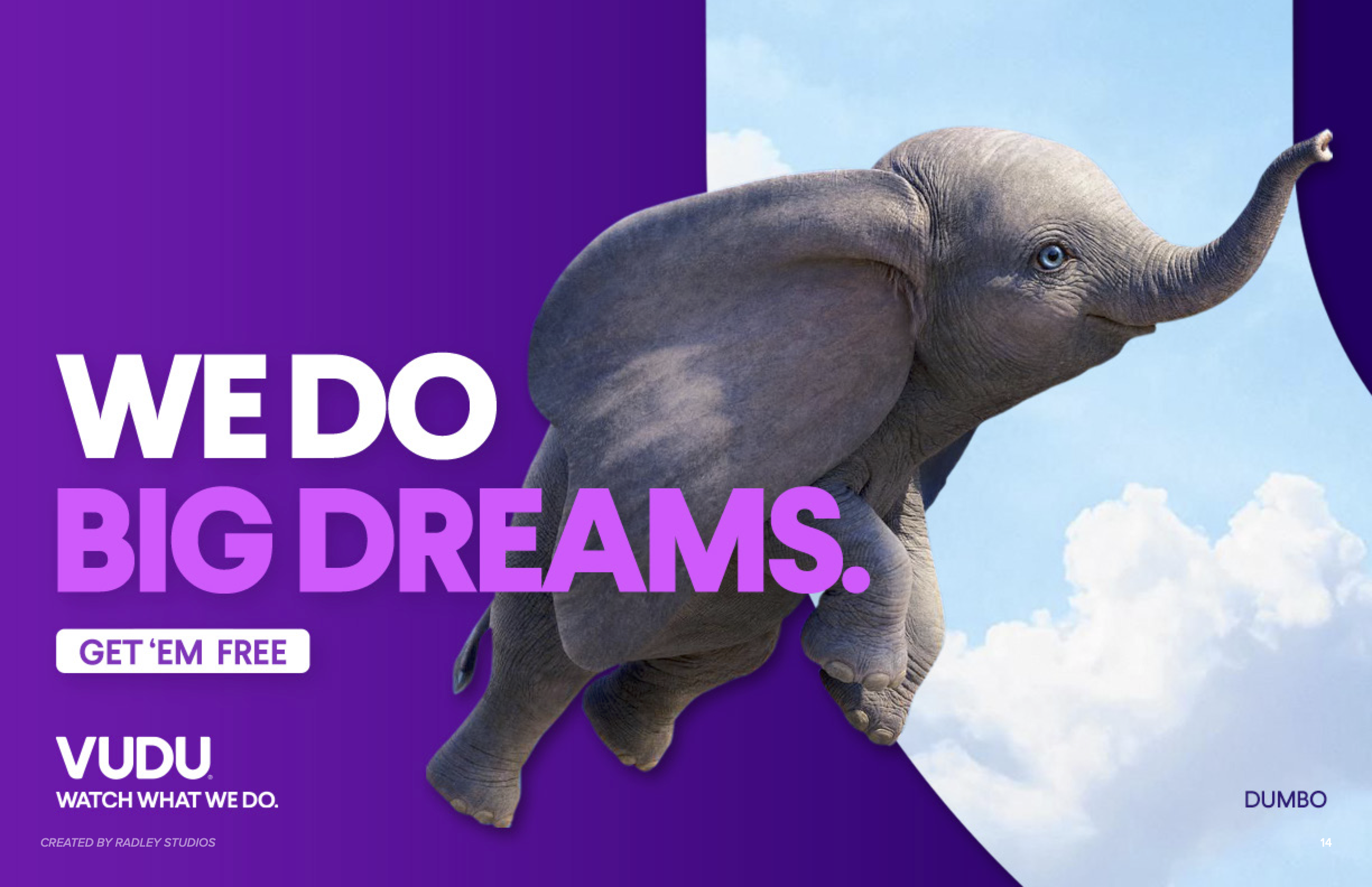
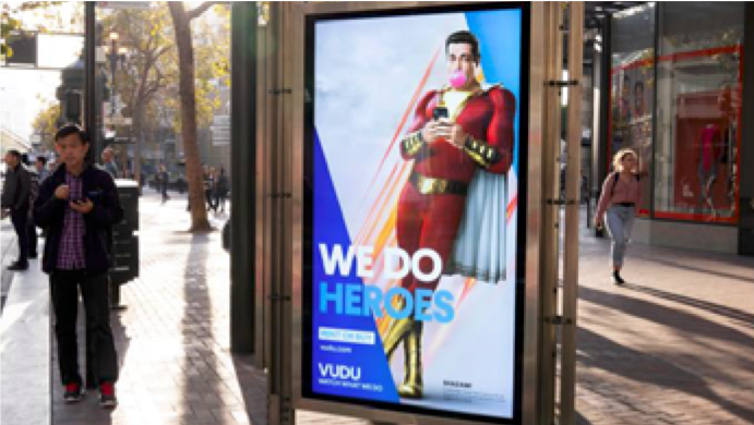
Managed & collaborated in providing the creative direction for guidelines for Vudu’s second re-design. Vudu had a business need to reintroduce its brand to its users, families and prospects in regards to it key value props. I lead the initial creative direction for the team of designers designing Vudu next re-brand iteration. This exploration would inform all marketing, product, style guides to date, as well as Vudu’s first multi million dollar campaign “Watch What We Do”.
branding Exploration.
From four concepts driven by the yearly seasons and specific design aesthetics, The inspiration for Vudu’s re-brand comes out of the “Shapes” Concept that was explored, a combination of gradients, shape masking and key photography. to be used as design elements through out the our branding , product and marketign materials.

"Photography, Key Art" Concept
"Shapes" Concept

"Texture" Concept

"Pattern" Concept
branding direction “Shapes”
Design benefits were clear. The user was communicated a clear visual & written message of Vudu’s key values, deals, features and content. From a production standpoint the designers had a wide range of creative options that would always maintain a visual cohesiveness throughout all marketing and product work.
STYLEGUIDE.


CAMPAIGN “WATCH WHAT WE DO” STYLE GUIDE.


BRAND IN ACTIOn.
LOGo animation EXPLORATION.
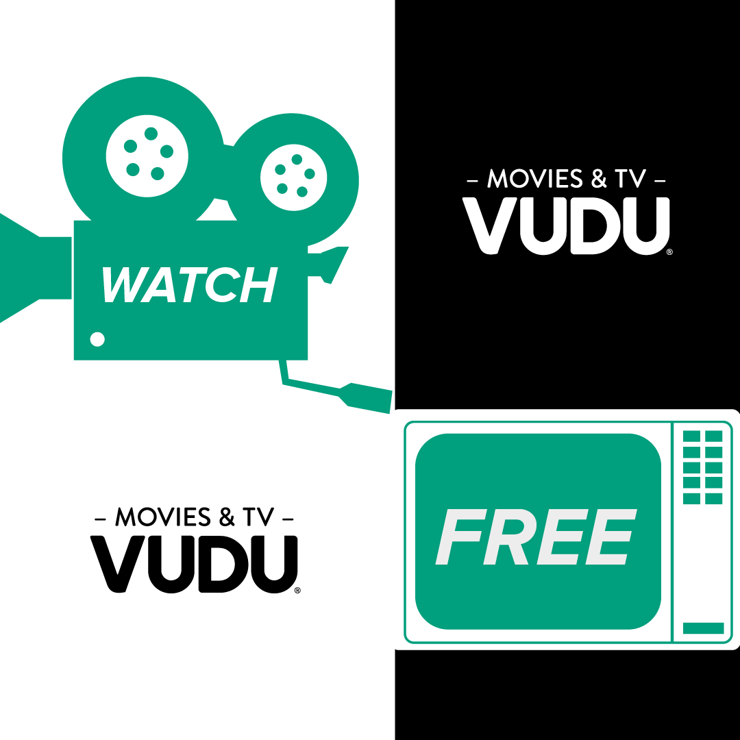
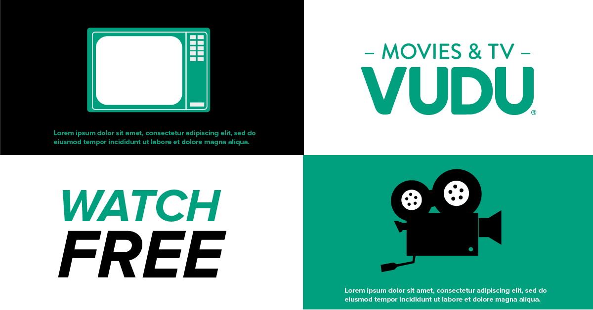
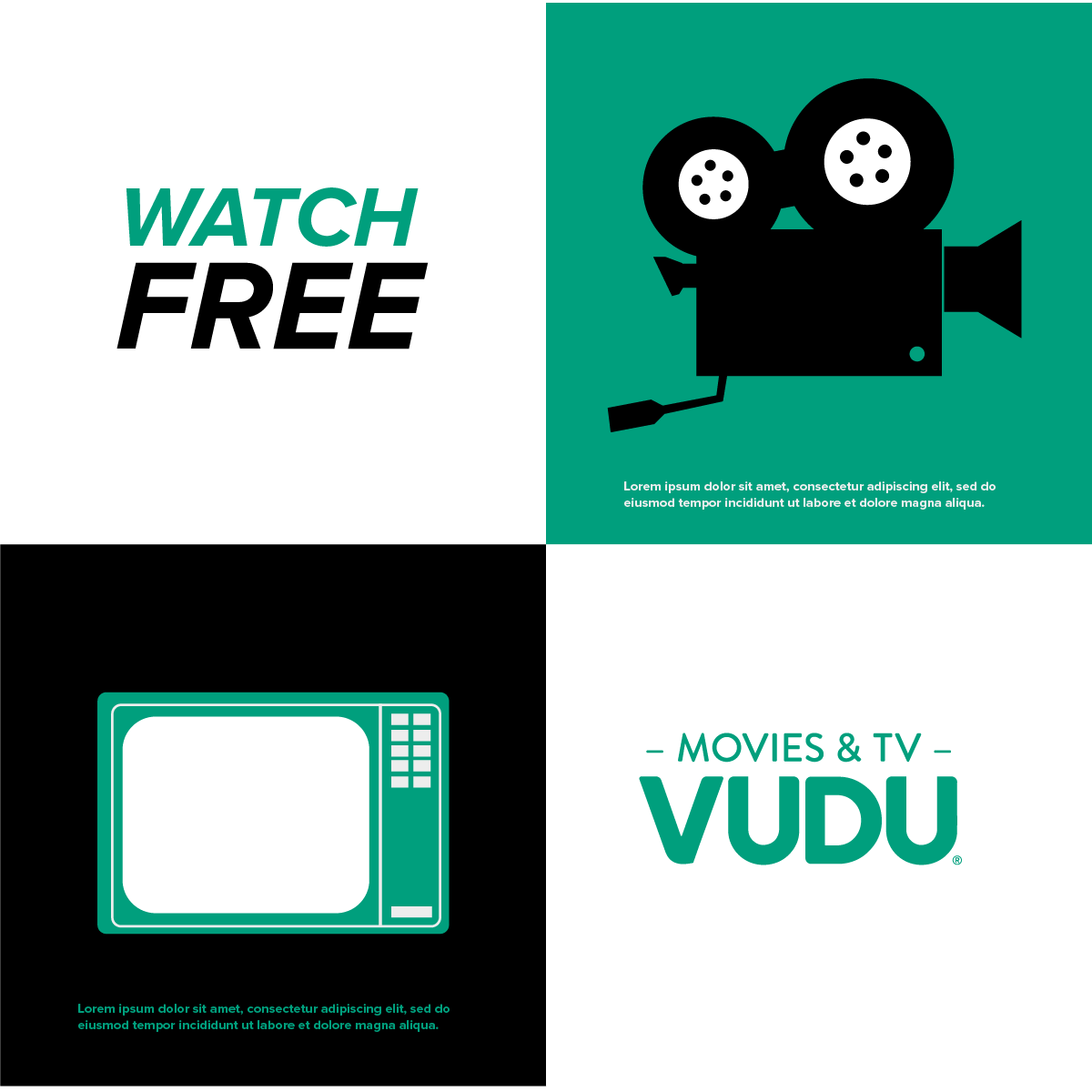
AVOD BRANDING EXPLORATION.
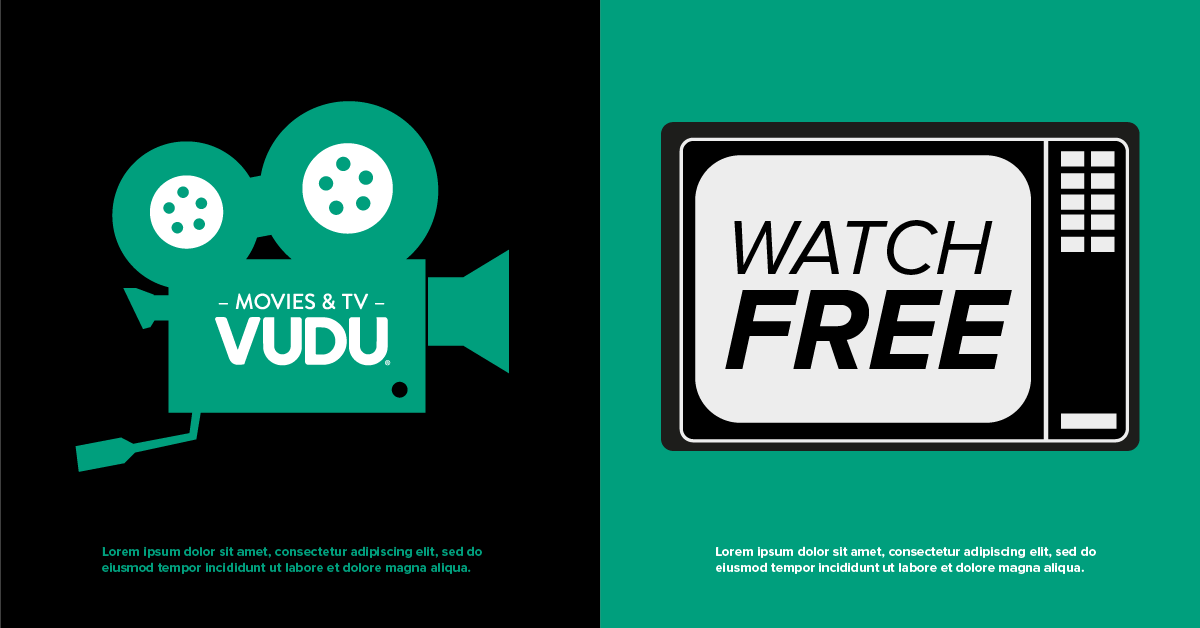
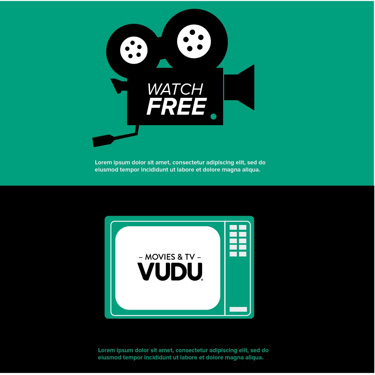
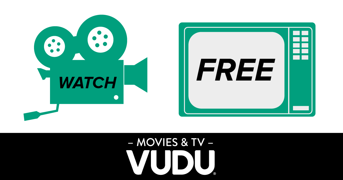
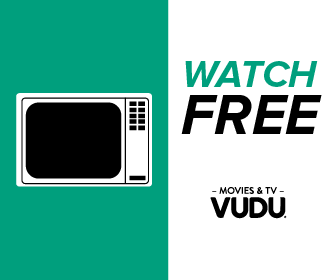
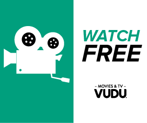
Vudu’s AVOD service ( free streaming content with advertisements), was exploring away to further stand out from the content that was bought or rented. This approach was designed to give more impact and specificity to the experience.


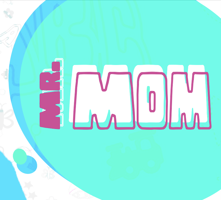
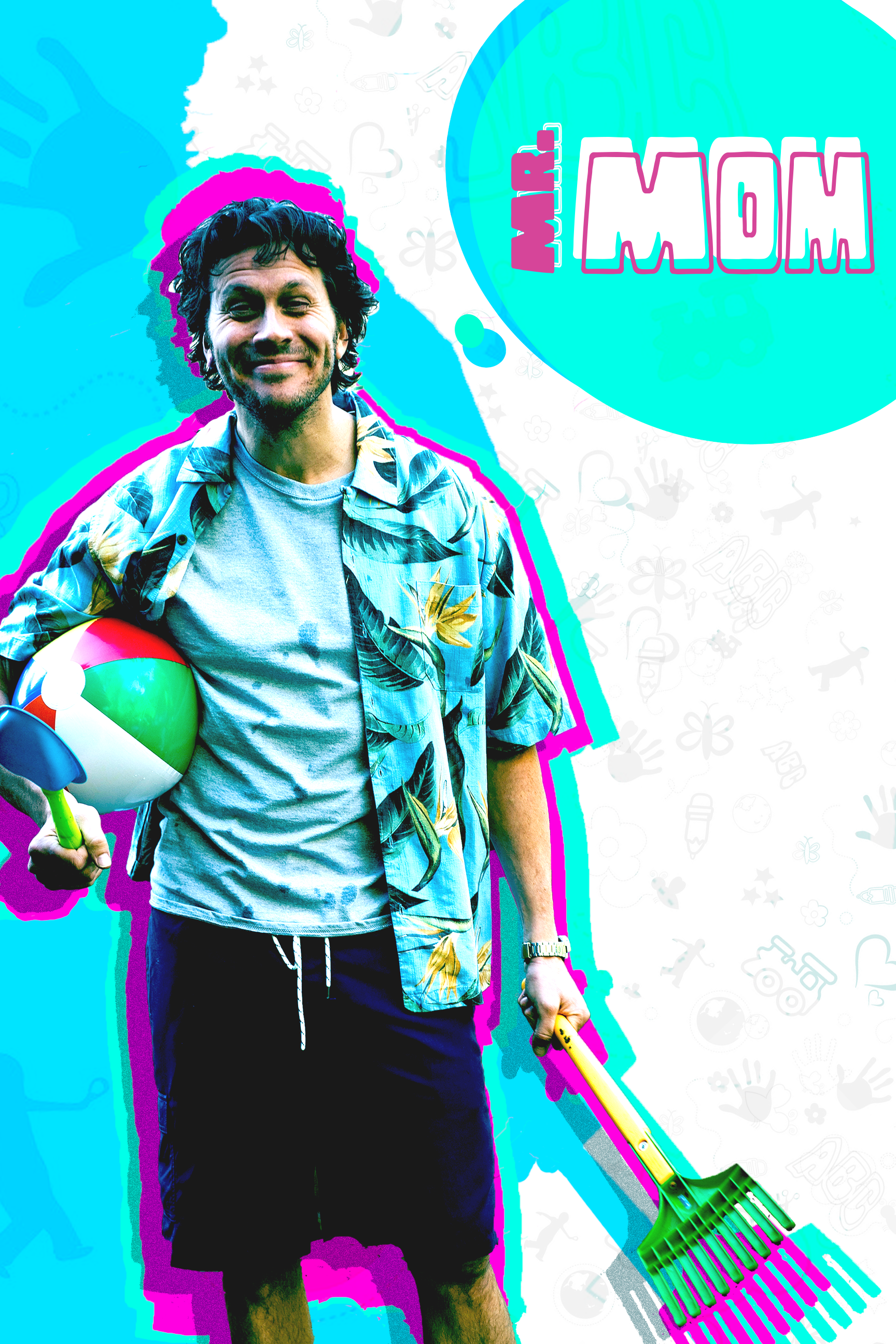
MR.MOM BRANDING EXPLORATION.
In partnership with MGM,, Vudu created original content. These designs explore key art & logo concepts for the re-make of Mr. Mom.